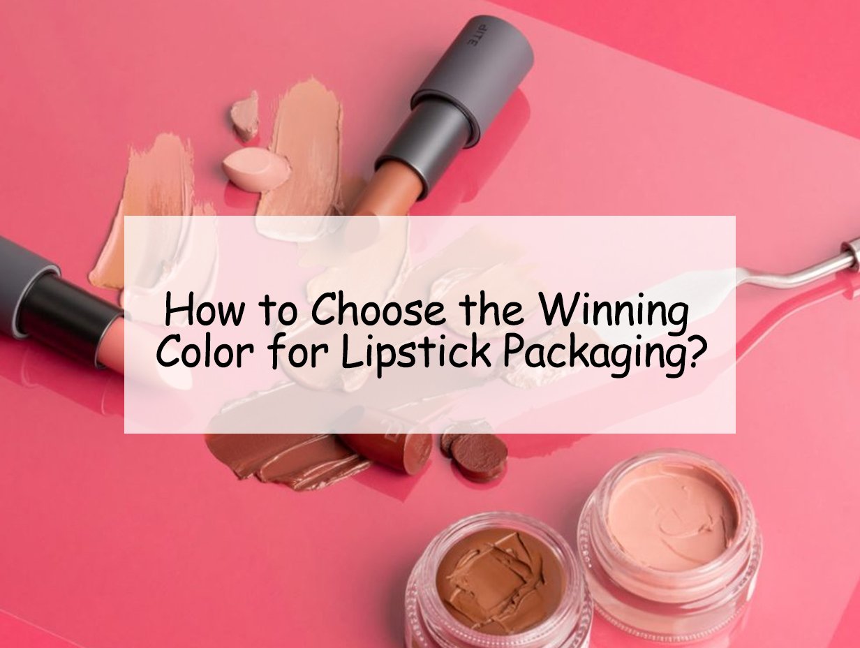
Choosing the perfect color for lipstick packaging can make or break your product's success. The right color speaks to consumers, making them want to buy it immediately.
Selecting the right color for lipstick packaging is key for attracting your target audience and differentiating in a crowded market. A deliberate choice enhances product appeal and fosters enduring brand recognition, ensuring your products not only catch the eye but also resonate with consumers.
How can your lipstick packaging stand out and resonate with your target market? Explore key decision factors.
Understand Your Target Audience
Choosing the right color is all about aligning with the preferences and desires of your target audience. The right color not only attracts attention but also evokes the emotions that your customer associates with beauty products.
Your packaging color should reflect your consumer's preferences, ensuring it resonates with their tastes, lifestyle, and purchasing motivations. For example, vibrant and bold colors may appeal to a younger, trend-driven demographic, while more muted, sophisticated shades could attract an older or more luxury-oriented crowd.
](https://jinlinpackaging.com/wp-content/uploads/2024/11/Understand-Your-Target-Audience.jpg)
Consider conducting market research to understand the visual preferences of your audience, especially in terms of color psychology. What emotions does the color evoke? Does it convey luxury, fun, or nature? A deep understanding of your audience will guide you toward the most effective color choices.
Audience Insights:
| Age Group | Color Preferences |
|---|---|
| Teens and Young Adults | Bold, vibrant colors, neon or pastel shades. |
| Professionals and Mature Adults | Elegant, neutral, or deep colors like burgundy or nude. |
| Eco-conscious Consumers | Earthy, natural tones or recyclable packaging. |
Stay on Top of Industry Trends
Staying ahead of cosmetic packaging trends is vital for ensuring your product remains relevant and desirable in an ever-evolving market.
In 2025, lipstick packaging is shifting toward minimalistic, elegant designs with more sustainable materials, which also impacts the choice of colors. Modern trends show an emphasis on simple yet striking packaging, and popular colors often follow global fashion trends or seasonal changes.
](https://jinlinpackaging.com/wp-content/uploads/2024/11/Test-and-Collect-Feedback.jpg)
Research current beauty industry packaging trends to identify what is gaining traction in the market. For example, muted pastel shades and metallic finishes are gaining popularity in high-end beauty products, while bold, matte tones are frequently associated with edgy, rebellious brands. By aligning with these trends, you ensure that your product feels fresh and up-to-date.
Trending Colors in 2025:
| Trend | Color Options |
|---|---|
| Minimalist & Sustainable | Soft pastels, clear glass with neutral caps. |
| Luxe Packaging | Deep burgundy, black, gold accents. |
| Bold & Rebellious | Matte black, electric blue, metallics. |
Align with Your Brand Identity
Your packaging color should be an extension of your brand identity. The right color reinforces what your brand stands for, whether that’s luxury, fun, or eco-consciousness.
If your brand positions itself as high-end and exclusive, consider using rich, deep colors like gold, navy, or black. For a more playful or trendy brand, colors like bright pink, coral, or even neon can convey energy and excitement.
Colors evoke emotions and can create instant recognition. Think about iconic beauty brands—Chanel’s black and white, or MAC’s use of bold and vibrant tones. Consistency in color helps your brand become instantly recognizable and strengthens its positioning in the market.
Brand Alignment Example:
| Brand Image | Recommended Colors |
|---|---|
| High-End/Luxury | Gold, deep red, silver, black. |
| Fun & Playful | Neon pink, purple, bright red, lime green. |
| Eco-conscious & Natural | Earthy greens, soft browns, beige, cream. |
Reflect the Product's Effect and Personality
The packaging color should reflect the product’s characteristics and the effect it will have on the consumer. A deep red packaging, for instance, may symbolize a rich, luxurious lipstick, while a soft pink could indicate a light, natural look.
The personality of the lipstick, whether matte, glossy, or shimmer, should also influence the choice of color. Matte finishes often align with darker or more understated tones, while glossy or shimmer products may benefit from lighter, more playful hues.
](https://jinlinpackaging.com/wp-content/uploads/2024/11/Align-with-Your-Brand-Identity-1.jpg)
Consider how the product’s formula and finish work with the packaging. If the lipstick is intended to create bold, statement-making lips, the packaging should be equally bold. Conversely, if the lipstick promises natural enhancement, the packaging should reflect softness and understated elegance.
Packaging-Product Alignment:
| Product Effect | Suggested Packaging Colors |
|---|---|
| Bold, Dramatic Color | Deep reds, rich purples, dark matte shades. |
| Natural, Subtle Effect | Soft pinks, nude, light pastels. |
| Glossy or Shimmer Finish | Metallic finishes, shiny textures, light neutrals. |
Prioritize Sustainability in Your Color Choices
Sustainability is increasingly influencing packaging decisions. Consumers are not only concerned about the product inside but also the environmental impact of the packaging.
Choosing eco-friendly and recyclable materials doesn’t just mean being good to the environment—it also appeals to eco-conscious consumers who are more likely to engage with brands that prioritize sustainability. Consider opting for biodegradable or recycled materials that align with modern consumer values.
](https://jinlinpackaging.com/wp-content/uploads/2024/11/Prioritize-Sustainability-in-Your-Color-Choices.jpg)
Sustainable packaging choices can also influence color selection. Earthy tones like forest green or terracotta, as well as clear, minimalist designs, can communicate your commitment to sustainability while remaining visually appealing.
Sustainable Color Choices:
| Sustainable Material | Recommended Colors |
|---|---|
| Biodegradable materials | Earth tones, natural whites, transparent materials. |
| Recycled plastic or glass | Soft pastels, frosted finishes, clear packaging. |
Test and Collect Feedback
Before finalizing your packaging color, it’s crucial to test different options and gather real-world feedback. Colors can evoke strong emotions, and the right one could be the deciding factor in whether your lipstick sells or sits on the shelf.
A/B testing allows you to directly compare multiple color choices, giving you concrete data to decide which shade resonates best with your audience. It provides insight into what works and what doesn’t, ensuring your packaging aligns with consumer preferences.
](https://jinlinpackaging.com/wp-content/uploads/2024/11/Test-and-Collect-Feedback-1.jpg)
Testing your packaging colors isn’t just about choosing the most visually appealing shade; it's about understanding how the colors affect consumer behavior and their emotional response to your product. What colors trigger positive reactions? Which ones are associated with trust, excitement, or luxury? These insights are crucial for your marketing strategy.
One effective approach is to conduct surveys or focus groups with a sample of your target audience. Show them various packaging options and ask for their opinions on color preferences. Collect both qualitative and quantitative data, analyzing factors like how the colors make them feel, their likelihood of purchasing the product, and their overall perception of your brand.
Key Points for Effective Testing:
-
A/B Testing: Create variations of your packaging with different color schemes and measure consumer response through sales, click-through rates, or survey feedback.
-
Focus Groups: Organize small groups of people from your target demographic and ask them to evaluate the packaging colors. This can reveal emotional triggers and associations with the color.
-
Social Media Polls: If possible, leverage social media platforms to run polls or test color schemes. This can quickly gauge public sentiment on a broader scale.
-
Real-world Feedback: Look at how similar products perform in the market, and test colors in environments like retail settings to see how they perform in-store.
The feedback you gather is essential in making a final decision that aligns with consumer expectations. By prioritizing feedback, you ensure that your color choice is data-backed and resonates with your target audience.
Consider Seasonal and Cultural Influences
Colors can have different meanings depending on cultural or seasonal contexts. Be mindful of cultural associations with specific colors, as they can vary significantly across regions.
Additionally, seasonal color preferences often shift. For instance, brighter, bolder colors may be favored in spring and summer, while deeper, more muted tones resonate during fall and winter.
](https://jinlinpackaging.com/wp-content/uploads/2024/11/Consider-Seasonal-and-Cultural-Influences-1.jpg)
Take cultural trends into account to avoid colors that could have unintended associations in certain regions. Also, consider creating seasonal variations of your packaging to keep the product fresh and relevant throughout the year.
Seasonal and Cultural Color Variations:
| Season | Recommended Colors |
|---|---|
| Spring & Summer | Bright, vibrant colors (yellow, pink, coral). |
| Fall & Winter | Deep, warm colors (burgundy, chocolate, plum). |
| Cultural Significance | Red (good fortune in China), white (mourning in some cultures). |
Conclusion
Selecting the right lipstick packaging color is a strategic decision that requires a deep understanding of your target market, brand identity, and industry trends. Consider all factors to make the best choice.